
Mind-blowing Hidden Signs in Logos of Famous Brands
Advertisement
Brand logos are powerful symbols that have the potential to evoke feelings, memories, and opinions. From Apple to Amazon, some of the world's most famous logos are instantly recognizable and associated with the companies and their values.
Logos can help companies stand out from the competition and create a strong and lasting bond with consumers. From the colors to the shapes and symbols, each logo has a story behind it that reflects the company's values, mission, and history. Let's find out the mind-blowing hidden signs in logos of these famous brands.
1. FedEx
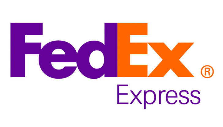
FedEx is one of the world’s leading delivery companies and its logo is no exception.
The logo is basically the name of the company in bold purple and orange letters on a white background.
But did you notice that there is actually an arrow hidden between the "E" and the "X"?
It is said that the arrow not only represents the speed and accuracy of the company's services, but also represents the company's commitment to forward progress and the constant striving for excellence.
The color of the logo is also significant, as purple is often associated with wealth, royalty, and power: a subtle suggestion of the company's strength and prominence in the industry.
2. Toblerone
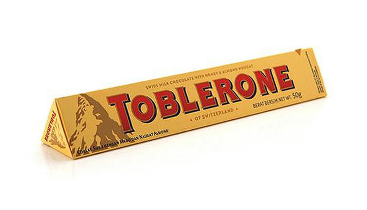
Toblerone is a popular Swiss chocolate brand, which is best known for its iconic triangular shape.
The logo features an image of the Matterhorn, and the company's name in bold, capital letters.
However, there is something you may be unaware of its presence until your look more closely at the logo – a bear standing on its hind legs!
The bear is believed to be a symbol of Bern, the capital of Switzerland, where Toblerone was first made. In addition, it is a symbol of strength and courage – two qualities that Toblerone embodies.
3. Amazon
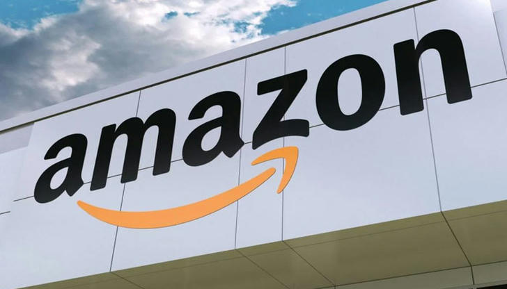
The iconic logo of Amazon has become ubiquitous and is recognizable the world over.
The orange curved arrow is meant to symbolize the smile that customers experience when shopping with Amazon.
What's more, the arrow points to the letter "Z", which is intended to evoke the idea of shopping from A to Z. It symbolizes the company's wide selection of products, as well as the customer-centric nature of the Amazon brand.
The arrow is curved to give the impression of movement, which further emphasizes the idea of shopping and finding what you need quickly and easily.
4. NBC
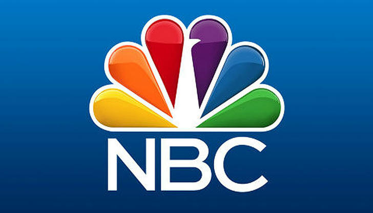
The NBC logo has been used on the network's programs for more than six decades since it was designed by graphic designer Paul Rand in 1956.
The combination of a rainbow-colored peacock and the letters "NBC" has become one of the most iconic logos of all time.
The six-feathered peacock is designed to represent the network's themes of pride, color, and vibrancy. The colors of the logo represent the different elements of NBC's programming, including news, sports, variety, and entertainment.
The peacock has been modernized over the years but still remains one of the most recognizable logos in the broadcast industry.
5. Picasa
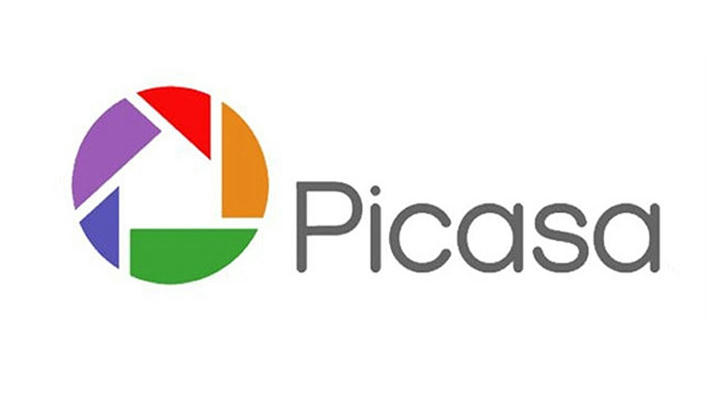
Picasa was a photo-sharing and editing software created by Google in 2022 that users can store, view, and edit their photos in an online gallery.
Although this beloved software was discontinued in 2016, its logo is a great example for simple and recognizable design.
The company's logo was a simple design of a camera lens, which was meant to symbolize the software's purpose of providing users with an easy way to take, store, and share photos.
Since "casa" is Spanish for "house", there is a house in the center of the logo, which symbolizes a safe, secure place to store and organize photos.
6. Beats
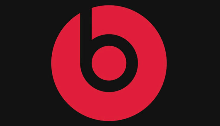
Whether you're a music lover or not, chances are you've seen the iconic Beats logo emblazoned on its headphones.
The design of the Beats logo is inspired by the graffiti art of San Francisco. It was designed by Robert Brunner, a former Apple designer.
The logo consists of a white "b" (which represents Beats) in a round red background. And it also looks like a person wearing headphones and listening music.
This simple but stylish logo stands out from the crowd and grabs attention.It represents the company's core values — music, fashion, and lifestyle.
7. Unilever
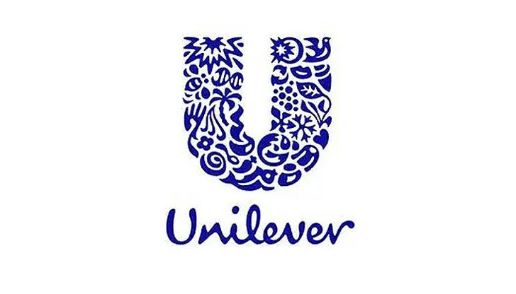
Unilever's logo is a bold, modern design that encompasses the company's core values and mission.
The "U" shape of the logo was created by Wolff Olins in 2004. The Unilever logo is made up of 25 distinct symbols, intricately woven together to form a U.
Each of these symbols has a unique meaning and represents a different aspect of the company's values. Some of them represent its brands, while some have deep meanings.
For example, The sun is a symbol of an infinite source of light and renewable energy, while the dove is a symbol of freedom, empowerment and self-esteem.
8. Pinterest
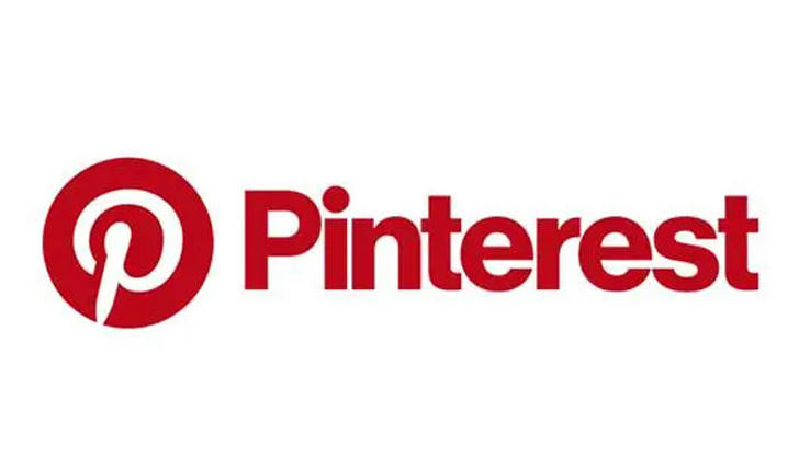
The logo of Pinterest is a white P in a red box, with a stylized, 3D-looking effect. The letter P is shaped like a pin, which is a metaphor for pinning content from the web onto a virtual pinboard.
The red box around the P gives the logo a professional and friendly look.
The 3D-like effect gives the logo depth and dynamism, reinforcing Pinterest's brand as an innovative, forward-thinking platform.
The logo is simple yet memorable, and perfectly communicates its core idea of "pinning" ideas and content.